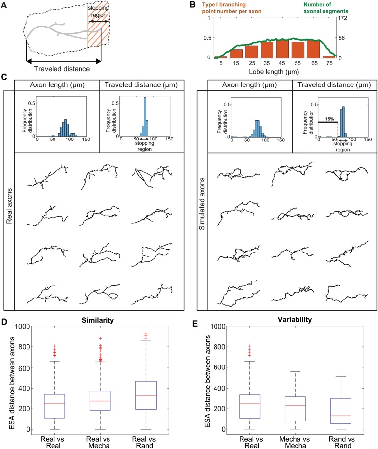
Fig 5. Simulation of γ axon growth within a population of interacting axons.
(A) Schematic representation of a single main γ axon within the medial lobe. Both the stopping region (shaded region) and the traveled distance (projection along the horizontal axis) are indicated. Axonal trees that fail to elongate a branch reaching the stopping region are considered as non-elongated. (B) Correlation between the spatial distribution of type I branching point number and axonal density. The orange bars represent the number of type I branching points per axon along the lobe axis. The green curve represents the number of axonal segments found in each lobe region. Data from reconstructed real axons were used for this analysis. (C) Top: Frequency distributions of 2D-projected main axon lengths (left panels), and traveled distances within the medial lobe (right panels). Data from real wild-type γ axons are shown in the left panels (n = 43), and data from simulated ones in the right panels (n = 650). The black arrows indicate the stopping region. The distributions of 3D main axon lengths are shown in S8A Fig. The definition of main axon is provided in Supporting information. Bottom: Examples of reconstructed real single wild-type γ axons (left) and simulated γ axons (right). (D) Measure of similarity between real and simulated axons. Boxplots of inter-axon distances within the population of real axons (real, n = 43), and between real and simulated axons, considering either mechanical (mecha) or random (rand) branching (n = 50 in both cases). (E) Measure of intra-population morphological variability. Boxplots of inter-axon distances within the population of real axons (real, n = 43), and within the population of simulated axons, considering either mechanical or random branching (n = 50 in both cases). Inter-axon distances were calculated with the ESA distance [40]. Boxplots were created following the original plotting convention of Tukey. The central mark indicates the median, the bottom and top edges of the box indicate the 25th and 75th percentiles, respectively. The whiskers extend to the most extreme data points not considered as outliers. Outliers are plotted individually using the ‘+’ symbol.

