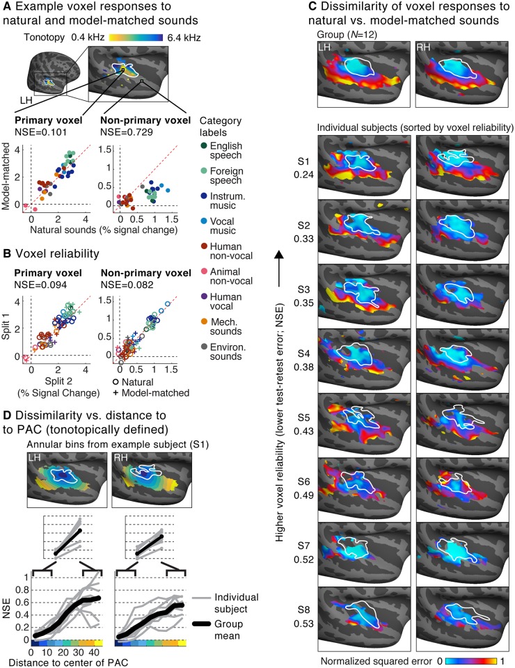
Fig 3. Voxel responses to natural and model-matched sounds.
(A) Responses to natural and model-matched sounds from two example voxels from a single subject. One voxel is drawn from the low-frequency region of PAC (defined tonotopically) and one from outside of PAC. A tonotopic map measured in the same subject is shown for anatomical comparison; the map plots the pure tone frequency that produced the highest voxel response. Each dot represents the response to a single pair of natural and model-matched sounds. The primary voxel responded similarly to natural and model-matched sounds, while the nonprimary voxel exhibited a weaker response to model-matched sounds. We quantified the dissimilarity of voxel responses to natural and model-matched sounds using a normalized squared error metric (NSE) metric (see text for details). (B) Split-half reliability of the responses to natural (circles) and model-matched sounds (crosses) for the two voxels shown in panel A. Both primary and nonprimary voxels exhibited a reliable response (and thus a low NSE between the two measurements). (C) Maps plotting the NSE between each voxel’s response to natural and model-matched sounds, corrected for noise in fMRI measurements (see S4 Fig for uncorrected maps). Maps are shown both for voxel responses from eight individual subjects (who were scanned more than the other subjects) and for group responses averaged across 12 subjects in standardized anatomical coordinates (top). The white outline plots the boundaries of PAC, defined tonotopically. Only voxels with a reliable response were included (see text for details). Subjects are sorted by the median test-retest reliability of their voxel responses in auditory cortex, as measured by the NSE (the number to the left of the maps for each subject). (D) A summary figure plotting the dissimilarity of voxel responses to natural and model-matched sounds as a function of distance to the low-frequency region of PAC (see S5 Fig for an anatomically based analysis). This figure was computed from the individual subject maps shown in panel C. Voxels were binned based on their distance to PAC in 5-mm intervals. The bins for one example subject (S1) are plotted. Each gray line represents a single subject (for each bin, the median NSE value across voxels is plotted), and the black line represents the average across subjects. Primary and nonprimary auditory cortex were defined as the average NSE value across the three bins closest and farthest from PAC (inset). In every subject and hemisphere, we observed larger NSE values in nonprimary regions. Note that the left hemisphere has been flipped in all panels to facilitate comparison between the left and right hemispheres. LH, left hemisphere; PAC, primary auditory cortex; RH, right hemisphere.

