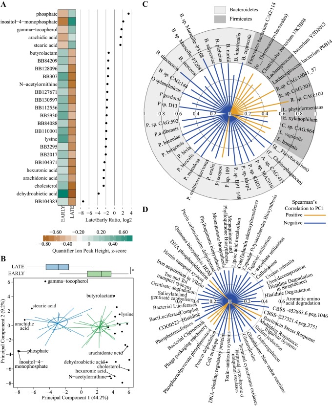
Fig. 6.
Metabolomics differences in Early and Late stages of diabetes progression in cecal contents from and University of California, Davis Type 2 Diabetes Mellitus (UCD-T2DM) rats. A: discriminant metabolites from untargeted metabolomics assessment of primary metabolism (gas chromatography-quadrupole time-off-flight-mass spectrometry). Each point represents the log2-fold ratio of a selected metabolite between Early and Late stages of diabetes progression in UCD-T2DM rat. Heatmaps represent the medians of scaled quantifier peak ion heights. Discriminant metabolites determined as follows: separate partial least squares-discriminant analysis (PLS-DA) models were fit for Early and Late stages of diabetes and year of collection classifiers. Lower bounds of adjusted bootstrap percentile confidence intervals of variable importance in projection calculations (VIPbootCI) were assessed both models. Featured variables were selected if VIPbootCI >1 in Early vs. Late PLS-DA and VIPbootCI <1 in collection year model. UCD-T2DM rats included rats before onset of diabetes (PD; n = 15) or 2 wk (RD; n = 10), 3 mo (D3M; n = 11), and 6 mo (D6M; n = 7) postonset of diabetes. Rats in PD and RD groups were classified as “Early” and D3M and D6M were classified as “Late.” Classifiers for year of collection were Y14 (n = 17) and Y16 (n = 26). B: scores plot (i.e., sample plot) of unsupervised principal component analysis of discriminant metabolites selected in A. Colored lines in principal coordinate analysis (PCoA) plots extend from group medoids to the PCoA scores that represent an individual rat. Ellipses are the SE of the point scores along principal component analysis of the 2 components. Metabolite loadings are overlaid on top of scores plot. Boxplot on top of graph indicate groups differences of scores along principal component 1 (PC1). *Statistical differences between groups, as assessed by Kruskal-Wallis test. Outliers in boxplots are displayed as a black dot extending from whisker(s). C and D: radial plots of significant correlations (Spearman’s) among PC1 from B and featured bacterial species (top) and functional gene cluster (bottom). Radial circles indicate Spearman’s rank correlation coefficient (rho) level. Orange lines extending from middle are positive rho coefficients and blue lines are negative rho coefficients.

