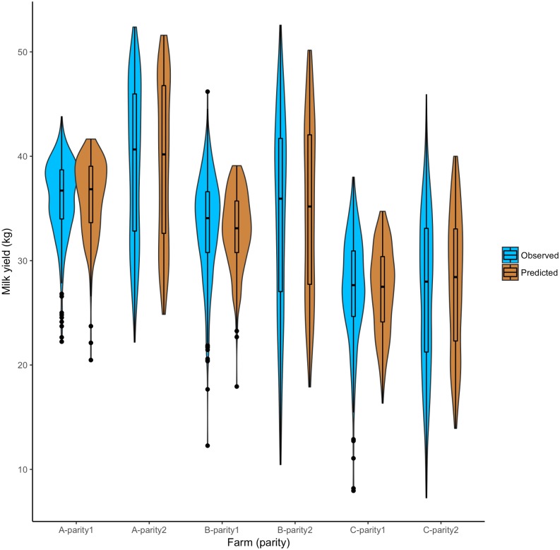
Fig 2. The comparison of observed and model predicted milk yield distribution for 1% simulation using best-fit parameters for the milk yield.
In the box plot, the bottom and top end of the bars are minimum and maximum values respectively, the top of the box is the 75th percentile, the bottom of the box is the 25th percentile, and the horizontal line within the box is median; outliers are presented as a solid black circle and the density of the milk yield is presented by the width of the violin.

