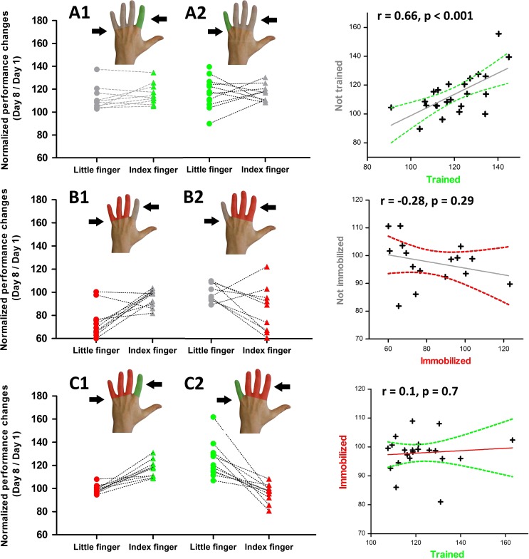
Figure 2.
Individual changes in tracking accuracy from days 1 to 8. Left panels: The y values reflect individual tracking accuracy at day 8 expressed as percentage of day 1 for each group. Right panels: The scatter graphs plot the individual performance changes for the two fingers of the same hand separately for each group. The straight gray line reflects the fit of the linear regression and the curved lines represent the 95% confidence interval.

