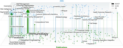
Fig. 6.
Strength of influence mapping. Top 200 most frequent skills in jobs (blue) and in publications (green) plotted on the skills basemap from Fig. 2. Arrows represent skills with significant Granger causality (P value < 0.05). Line thickness and label size indicate skill frequency. The direction and thickness of each arrow indicate the F-value strength and direction.

