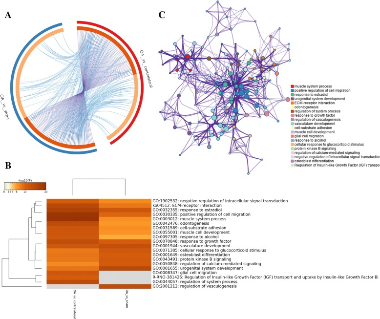
Fig. 5.
Meta-enrichment analysis summary for DEGs lists in two comparison cohorts. a Overlap among gene lists at the gene level, where purple curves link identical genes and blue curves link genes belong to the same enriched ontology term. The inner circle represents gene lists, where hits are arranged along the arc. Genes hit multiple lists are colored in dark orange, and genes unique to a list are shown in light orange. b Heatmap of top 20 enriched terms across two gene lists, colored by p values. c Network of enriched terms are colored by cluster ID and nodes share the same cluster are typically close to each other. a–c Produced using Metascape (http://metascape.org/gp/index.html#/main/step1)

