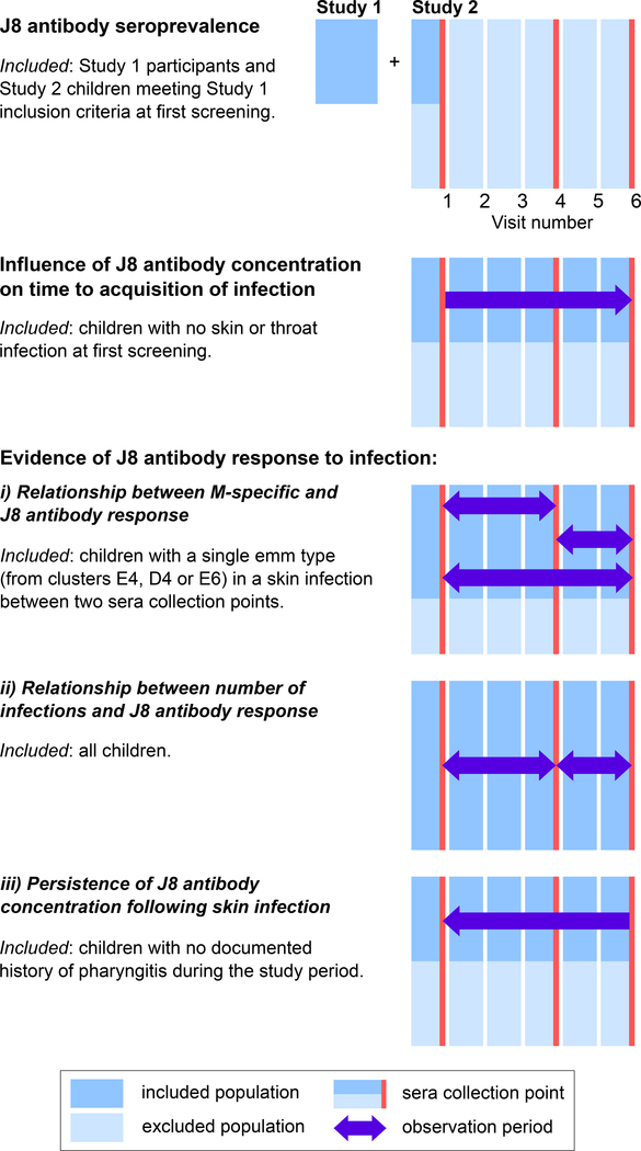
Figure 1:
Participants for the five analyses were drawn from a cross-sectional study (“Study 1”) and a prospective longitudinal cohort study (“Study 2”). Study 1 participants were only included in the seroprevalence analysis and Study 2 participants were included in all analyses, with the infographic showing the sub-populations included in each analysis. There were six screening visits in Study 2 (blue bars) with blood collections occurring at three of these (red bars). For each analysis, at each visit, the excluded population is shown in light blue and the included population in dark blue. Single colour bars represent the inclusion of all participants (dark blue) or exclusion of all participants (light blue), with the combined light/dark blue bars representing the inclusion of some participants. Arrows represent the direction of observation, with participants followed either prospectively or retrospectively until infection occurred. Double-headed arrows represent the inclusion of data for the entire period spanned by the arrows.

