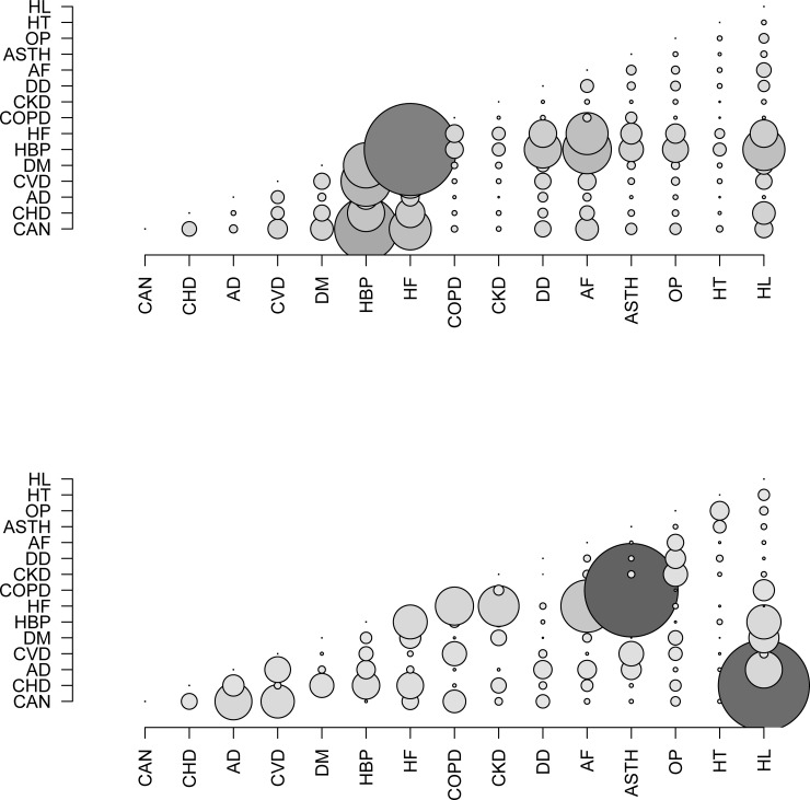
Fig 2. Bubble chart.
(a) Bubble chart for the prevalences observed. A larger bubble indicates a higher observed prevalence of the dyad. (b) Bubble chart for the associations between chronic diseases, measured with the chi2 statistic. A larger bubble indicates a stronger association between the diseases. CAN = cancer; CHD = coronary heart disease; AD = Alzheimer’s disease; CVD = cerebrovascular disease; DM = diabetes mellitus; HBP = high blood pressure; HF = heart failure; COPD = chronic obstructive pulmonary disease; CKD = chronic kidney disease; DD = depressive disorder; AF = atrial fibrillation; ASTH = asthma; OP = osteoporosis; HT = hypothyroidism; HL = hyperlipidemia.

