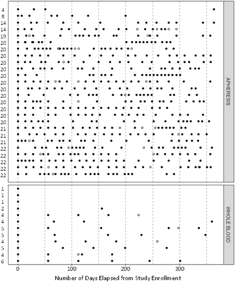
Fig. 2.
Cleveland dot plot of donations (solid dots, n = 543) and deferrals (open dots, n = 38) from donors during the ALTRUYST study. The top panel shows donors randomized to apheresis and the bottom panel shows donors randomized to no apheresis (i.e. whole blood only). Each donor is represented as a row with the number of successful donations made during the study shown to the left.

