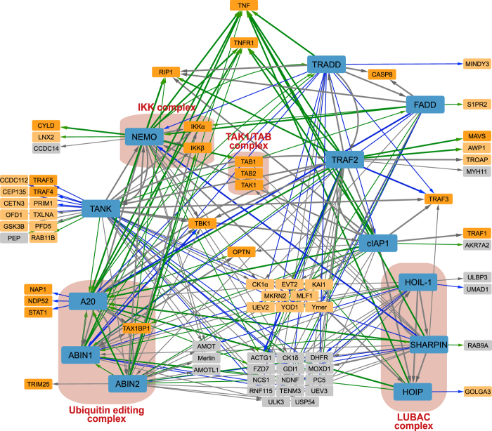
Figure 3. Lean network visualization.
The bait proteins are represented by blue nodes. The nodes of interacting proteins are represented smaller and in intense orange when they have a well-known function in NF-κB and/or cell death signaling, in light orange when they can be linked to NF-κB and/or cell death signaling, and in grey when no function or link with NF-κB and/or cell death signaling is known so far. Interactions (edges) are represented by arrows that point from the bait protein to the identified interacting protein. Interactions that are independent of TNF treatment are shown in grey, interactions that appear or disappear upon TNF treatment are shown in green and blue respectively. Known interactions in the BioGRID database are represented by thicker lines (edges). Well-known protein complexes are shown in red boxes.

