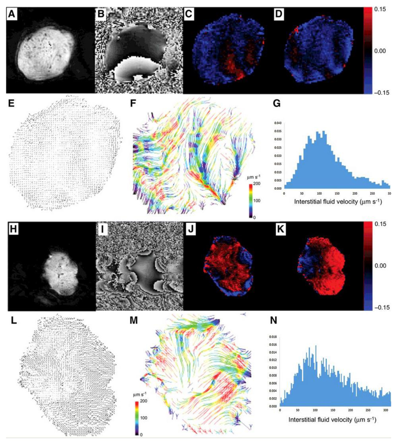
Figure 3.
Example convection-MRI data sets (both raw image data and processed image data) in two example LS174T tumor xenografts: representative magnitude (a, h) and phase (b, i) images; maps of the change in phase with velocity-encoding gradients applied in vertical (readout) (c, j) and horizontal (phase-encoding) (d, k) directions. Velocity vector maps (e, l) show the direction of fluid transport through the tumor interstitium, which is better visualised using a streamlining algorithm (f, m) to connect pathways of coherent fluid convection (bottom row, colored arrows). Streamlines are color-coded to reflect the local fluid speed, which is also represented in histograms (g, n).

