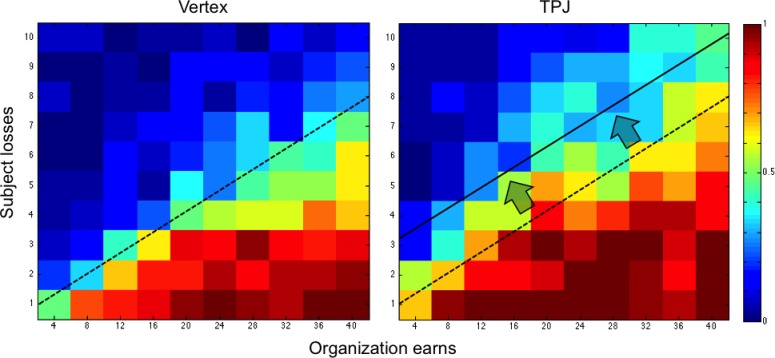
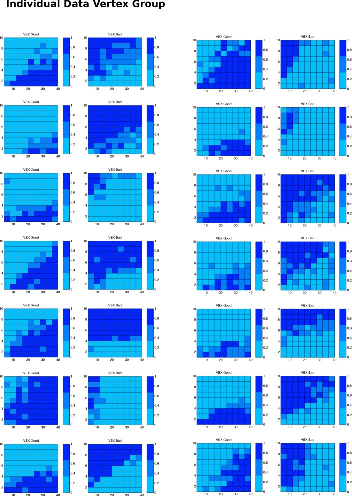
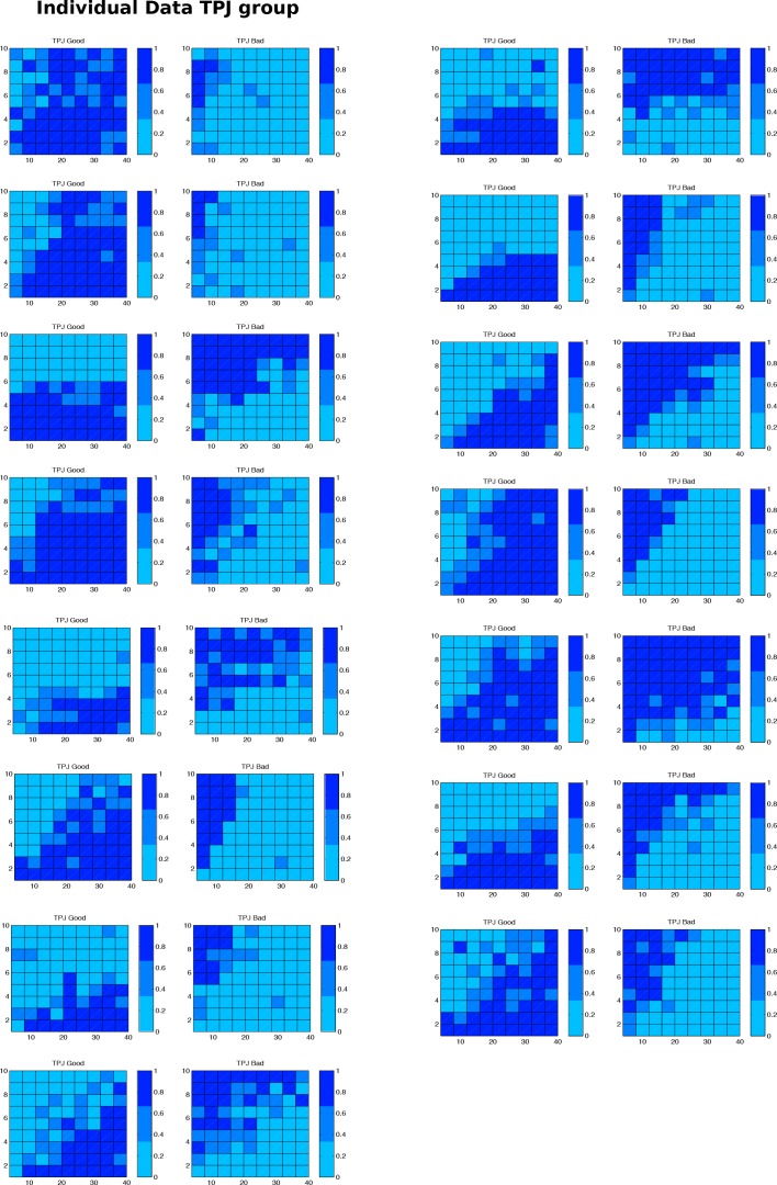
Figure 2. Color-coded map for probability of acceptance to donate (warm color shows greater acceptance probability; cold color lower acceptance probability) for the good organization in the control group (vertex) and TPJ group.
Trials relative to both audience conditions (public/private) are shown. The black line represents the control group’s responses at which donations were accepted with 50% probability for each given cost level. Vertical bar indicates the number of times a response was selected, that is one per subject.


