Figure 2.

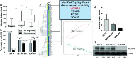
Increased MCPIP1 expression among low‐migratory cells. a) Comparison of the migration distances and percentage of high‐migratory versus low‐migratory cells (mean ± SD is shown in corresponding bar plots to represent the results) b) for MCF‐7, MDA‐MB‐231, and SUM‐159 cells. c) Left: Comprehensive heat map showing the expression levels of genes between high‐migratory and low‐migratory cells. Right: Row corresponding to the top 265 different expressed genes across these two subpopulations (upper panel). Principal‐component analysis (PCA) of the transcriptome of high‐migratory and low‐migratory cells sorted by SCM‐Chip from MDA‐MB‐231. Cells from the same group are shown as symbols of the same color. PCA1 and PCA2 represent the top two dimensions of the genes showing all expression among cells with different mobility, which accounts for 55.1% and 18.1% (lower panel). d) qRT‐PCR analysis of MCPIP1 mRNA level in MCF‐7, MDA‐MB‐231, and SUM‐159 cells. e) Western‐blot analysis of MCPIP1 protein level in MCF‐7, MDA‐MB‐231, and SUM‐159 cells.
