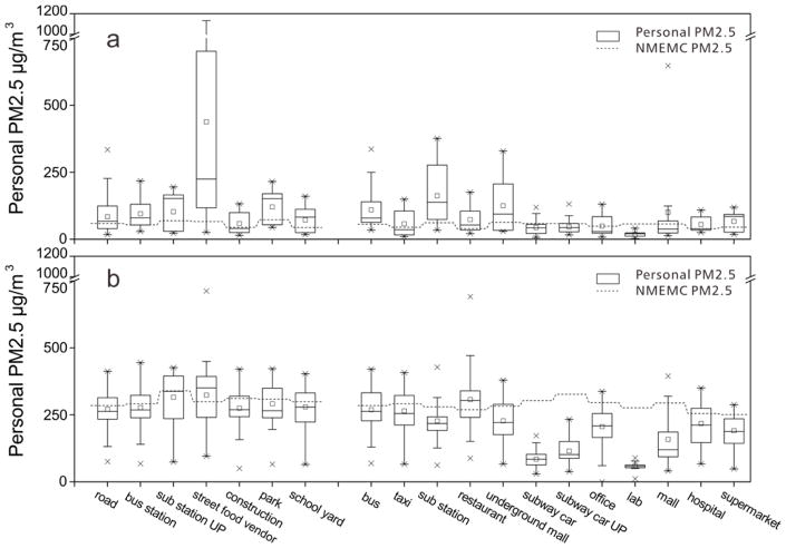
Fig. 3.
Personal exposure (minute average) levels in various MEs on non-hazy (Fig. 3(a)) and hazy (Fig. 3(b)) days and their comparison with EPA monitored PM2.5. a Bars from top to bottom, respectively, represent 90%, 75%, 50%, 25% and 10% of PM2.5 values, the stars are max/minimum PM2.5 values, while the box in the middle represents average PM2.5 concentrations in separate MEs. b Sub station and sub station UP represent underground and ground-level subway stations, respectively, while subway and subway UP represent underground and ground-level subway cars. c Similar sub-MEs have been goruped. Open MEs are grouped on the left while enclosed MEs are grouped on the right.

