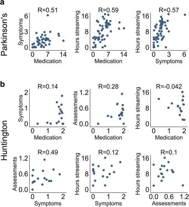
Fig. 3.

Individual variation in remote study protocol compliance metrics. Scatter plots depict the pairwise association for all compliance metric pairs. Each circle represents an individual patient, specifically the mean compliance rate for that patient. Data shown for the (a) PD and (b) HD studies. The distribution for individual metrics can be observed by looking at each individual axis. The R values in the plot are Spearman’s rank-order correlations. The positive correlations suggest that individual patients tend to have either high or low compliance rates across multiple remote study compliance metrics. Axis labels: Symptoms (mean daily symptom reporting events per patient), Medication (mean daily medication reporting events per patient), Hours streaming (mean smartwatch daily streaming hours per patient), and Assessments (mean daily structured motor assessments at home reported by patient). Axis values are counts or hours where appropriate
