
Fig. 5.
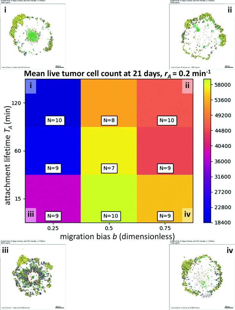
High-throughput 3-D cancer-immune simulation: impact of migration bias and and attachment lifetime. We plot a heatmap for final live cell tumor count (blue is lowest, or most effective immune response; yellow is worst immune response) for varied migration bias (horizontal axis) and immune cell attachment lifetime (vertical axis). Characteristic final tumor cross sections are labeled i-iv. In particular, decreasing migration bias improves the response