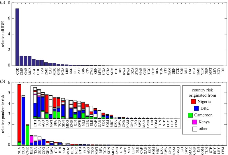
Figure 5.
Index rankings per country. Numbers displayed are the sums of all (a) eRIDE and (b) pandemic risk index pixel values that fall within the country boundaries as displayed in figure 4. Received pandemic risk is calculated for each country, and stacked bars indicate the relative contributions to risk from each country. Inset, increased magnification of the risk associated at the tail end of the graph.

