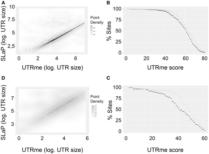
Figure 6.
Comparison of UTRme best scoring sites with the ones predicted by Slap mapper using Pastro et al. (2017) data. (A) Scatter plot of 5′ UTR lengths. Darker regions indicate higher density of points. (B) The percentage of points that have scores above a threshold is plotted for coincident and non-coincident sites. Dark gray: non-coincident sites. Light gray: coincident sites. The percentage was calculated until the number of sites remaining is above 10 (C,D). Same as (A,B) for 3′ UTRs.

