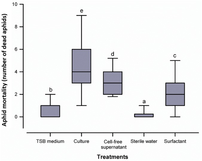
FIGURE 4.
Box plot representing aphid mortality with the five treatments tested. The centre line of the box depicts the median, the edges of the box reflect the 25th and 75th percentiles (interquartile range), and the whiskers depict the 10th and 90th percentiles. Different letters above the whiskers indicate significant differences (p ≤ 0.05) between treatments according to the Mann-Whitney U test.

