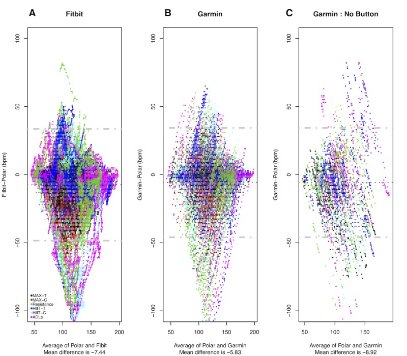
Figure 4.

Bland-Altman plots showing heart rate measurements comparing Garmin and Fitbit relative to Polar for all data with activities indicated by color. Mean heart rate is shown on the x-axis, and the difference between the Garmin or Fitbit and the Polar heart rate is on the y-axis. The gray dotted line indicates the mean difference (bias) between the measurement, and the gray dashed lines indicate the limits of agreement. Panel A compares the Fitbit and the Polar. Panel B compares the Garmin (with activity indication) and the Polar. Panel C compares the Garmin (with no activity indication) and the Polar.
