Figure 1.

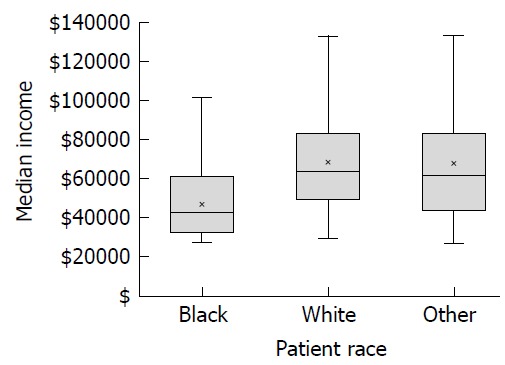
Median income level by race with the bold horizontal line representing the median, the box shows the 25% to 75% range, the x is the mean and the whiskers represent the entire range of the data.

Median income level by race with the bold horizontal line representing the median, the box shows the 25% to 75% range, the x is the mean and the whiskers represent the entire range of the data.