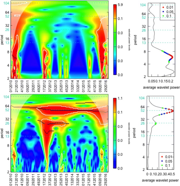
Fig. 2.
On the left, the wavelet power spectrum where: (i) values increase from blue to red, (ii) white contour lines indicates the 95% confidence interval and (iii) shaded regions on both ends delimiting the cone of influence. On the right, the graphic represents the average wavelet power over time, where dots indicate significant periods at different significance levels. In the top line, the results of Amapá, a northern state and; in the bottom, the Paraná wavelet results, in the south of the country

