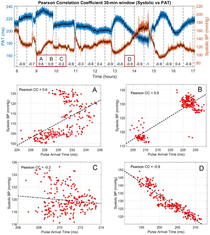
Figure 3.
Pearson correlation coefficient and systolic vs. PAT variation in 9 h of subject #1. Raw values of PAT and systolic BP are shown in blue and red, respectively with the corresponding median filtered values in black. The correlation coefficient is presented every 30 min in the lower part of the graph and the PAT vs. Systolic BP dispersion of 4 segments of interest are labeled (A–D).

