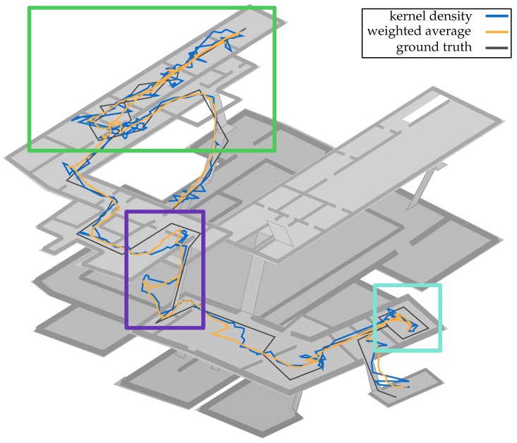
Figure 12.
Estimation results of walk 2 using the KDE method (blue) and the weighted-average (orange). While the latter provides a more smooth representation of the estimated locations, the former provides a better idea of the quality of the underlying processes. In order to keep a better overview, the top level of the last floor was hidden. The colored rectangles mark interesting areas. Within the green rectangle, the above mentioned differences between the two methods are clearly visible. The purple rectangle displays a situation in which a sample impoverishment was successfully resolved. The teal rectangle marks an area were both methods do not provide sufficient results.

