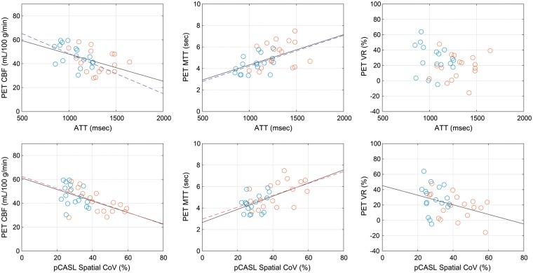
Figure 3.
Scatter plot of arterial transit time (ATT) measured by PASL [upper] and spatial coefficient of variation (CoV) in pCASL CBF images [lower] versus PET-based measures: CBF [left], mean transit time (MTT) [middle], and vascular reactivity (VR) [right]. Blue and red circles represent data from contralateral and ipsilateral ROIs, respectively. When correlations are statistically significant (p < 0.05), regression lines are also presented in blue (contralateral ROI only), red (ipsilateral ROI only), or black (pooled data).

