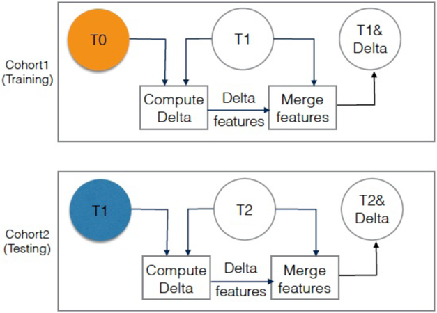
FIGURE 2:
Visualization of diagnosis experiment (experiment 1), where Cohort 1 T1 images quantitative features (SDLC) are used for training, and Cohort 2 T2 images quantitative features (SDLC) are used for testing. Orange circle is the baseline. Blue circle is second screen of Cohort2. The color is just to visually differentiate between the baseline and second screen when they are aligned under each other.

