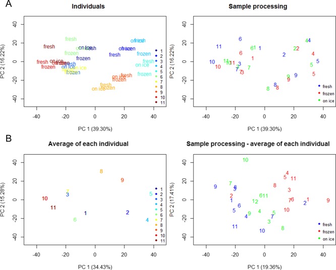
Figure 1.
PCA score plots of samples (A) colored by individual sample sets (top left) and the different sample procedures (top right) used in the study. Average of each individual sample set (B) was performed, plotted (bottom left), and subtracted to each sample (bottom right). Individual sample sets were labeled with numbers (1–11), samples sets 8 and 9 are from the same individual, and samples sets 10 and 11 are from the same individual.

