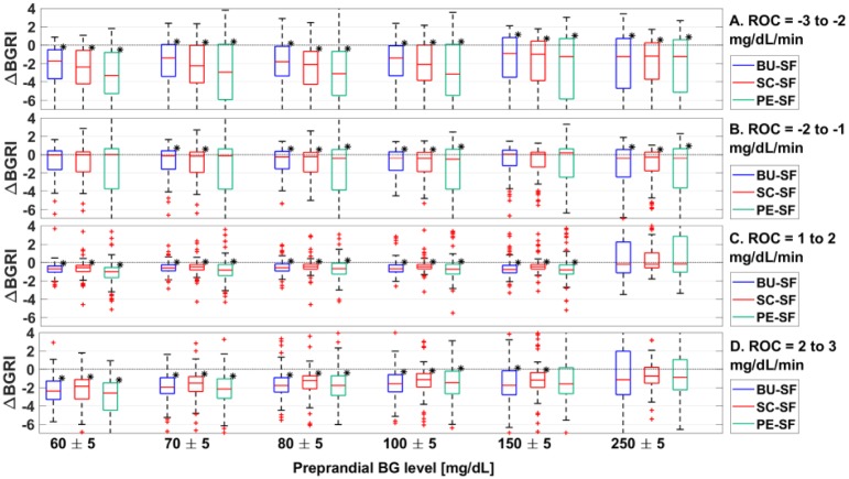
Figure 2.
Boxplot representation of the distribution of ΔBGRI obtained comparing BU versus SF (in blue), SC vs SF (in red), PE versus SF (in green) when ROC is −3 to −2 mg/dL/min (panel A), −2 to −1 mg/dL/min (panel B), 1 to 2 mg/dL/min (panel C), and 2 to 3 mg/dL/min (panel D). Red horizontal lines represent median, boxes mark interquartile ranges, dashed lines are the whiskers, red crosses indicate outliers. Black stars indicate statistical significant between-distribution differences. Lower ΔBGRI means better glucose control quality.

