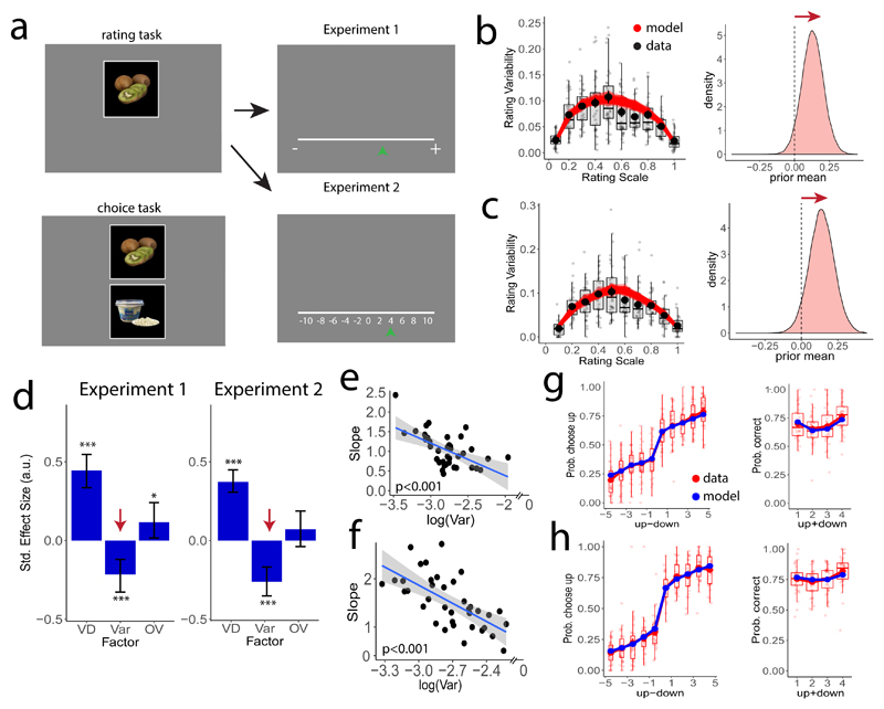
Figure 2. Paradigm and results for Experiments 1 and 2.
a) Example display from the preference rating phase (two rounds) during which the participants rated their preference to eat the displayed food item using a continuous scale (Experiment 1, n=38) or a discrete scale with numerical cues (Experiment 2, n=37). The lower-left panel shows an example display from the decision-making task requiring participants to choose which of the two items (upper or lower) they preferred to consume after the experiment. (b) Left panels show rating variability plotted as a function of each item’s mean rating across both rounds for experiment 1 (black dots show the mean across participants; dot error bars represent the s.e.m. across participants). Based on our model fits, we simulated 500 experiments in which we draw N=2 ratings for each good and plot the simulated rating variability as a function of the mean rating (semi-transparent red lines). Right panels show that posterior estimates of the expected value of the prior are shifted towards higher rating values (the zero position maps to the center of the rating scale). c) Same as panel b but for experiment 2. d) Standardized estimates from multiple logistic regression show that the higher the value difference VD between the mean ratings, the more consistent the choices. Crucially, the higher the variability in the ratings of the alternatives, the less consistent the decisions. Total value of the two ratings of each good had no reliable influence on choices across the two experiments. Error bars in this panel represent the 95% highest-density interval of the posterior estimates. (*) P<0.05; (***) P<0.001. e,f) The trial-to-trial effect shown in panel d was also reflected across participants, as the general level of variability in the rating task correlated negatively with the slope of a logistic regression (Experiment 1: panel e, βrobust = -0.77±0.20, P<0.001; Experiment 2: panel f, βrobust = -1.2±0.25, P<0.001). g,h) Observed data (red dots) match the model predictions (blue dots), plotted as a function of the two items’ absolute value difference ( in 10-tiles, left panels) and overall value ( in quartiles, right panels) (panel g: Experiment 1; panel h: Experiment 2). Lower and upper boxplot hinges correspond to the 25th and 75th percentile and each semitransparent dot represents the data of one participant.

