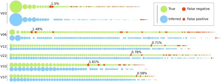
Fig 10. Comparison of true sequence abundances versus copy numbers inferred by FLEA for each time point of the simulated P018 data.
Each node represents one sequence, with the area denoting its relative abundance in the population. The true population (top) is colored green. For each true sequence, the matching HQCS sequences appears below it in blue. Red nodes denote false negatives and positives. The most common false negative for each time point is annotated with its abundance.

