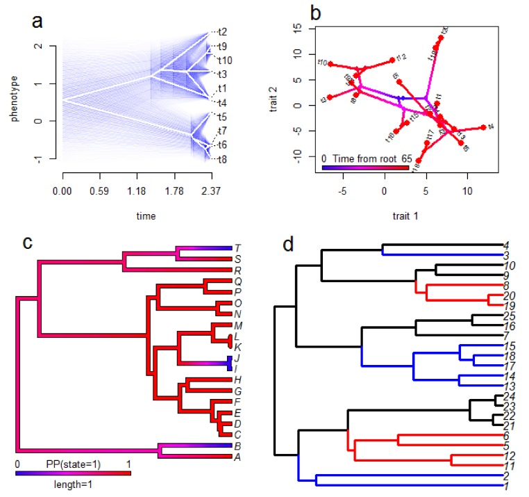
Figure 3.
Examples of visualisation methods for comparative biology. These examples are based on simulated data and are not comprehensive, but illustrate some possibilities for some of the methods discussed in this review. The ‘traitgram’ in panel (a) shows the evolution of the value of a single continuous trait (y-axis) over time (x-axis) based on ancestral state reconstruction with 95% confidence intervals shown as blue transparencies to indicate uncertainty. In panel (b) a ‘phylomorphospace’ plot is shown to illustrate the relationship between two continuous traits in the context of their phylogenetic history. The colour scheme of the phylogeny shows the time in which blue represents the time at the clade’s origin and red is the present day—from this we can clearly see the expansion of trait diversity over time. Panel (c) shows an ancestral state reconstruction for a two-state categorical trait with the colour scheme representing the probability of being in state 1 (as opposed to state 0). We can see that the ancestral state is likely to be 1 whereas three independent origins of state 0 have occurred over the phylogeny. Panel (d) displays the results of an analysis of convergent evolution using SURFACE (see Section 6), with different colours representing different regimes of trait evolution (not trait values) and shared colours reflecting convergent evolution of the same regime. In this example the blue regime has evolved independently three times and the red regime has evolved twice independently.

