
Figure 5. Single‐cell gene expression profiles recapitulate the predicted sequence of gene activation.
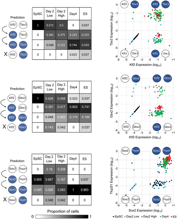
Left: 0.782 cABN predictions of the sequence of gene activation between gene pairs (white, Low; blue, High) along the resetting trajectory, compared to single‐cell gene expression measured by RT–qPCR. Each table summarises the percentage of single‐cells at the indicated stage of resetting (columns) that have the indicated expression state (rows). Right: Scatterplots showing single‐cell coordinates based on the expression of the gene pair.