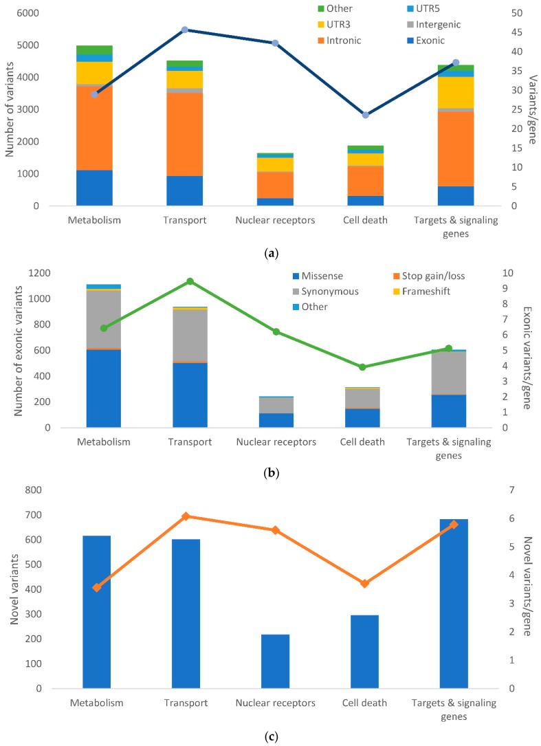
Figure 2.
Distribution of alterations in the studied groups of genes. The picture shows: (a) the frequency of genetic alterations according to their functional classes; (b) The frequency of genetic alterations according to their exonic functional classes analyzed by RefSeq: NCBI Reference Sequence Database (https://www.ncbi.nlm.nih.gov/refseq/) shown according to the groups of studied genes; (c) The number of novel variants according to the groups of genes. The number of the variants normalized to the counts of genes per each group are shown for each plot on the right axis and depicted by the overlaid line. Column plots for all gene groups are shown in Figure S2.

