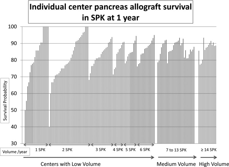
FIGURE 5.

Individual center pancreas allograft survival in SPK at 1 year. Each bar represents an individual center. Y axis shows survival probability and x-axis sorted by increasing volume (SPK/year) and then by survival (if centers have the same volume).
