
Fig. 2.
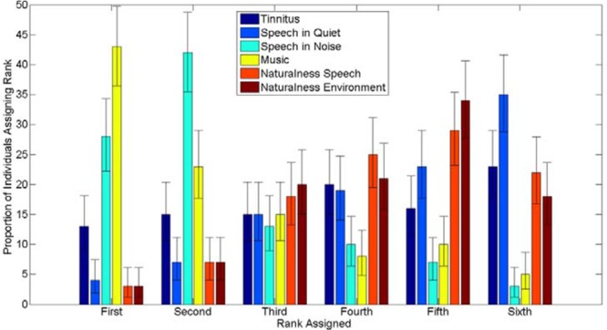
Bar chart showing the distribution of rankings of the separate domains of difficulty for all respondents. The y axis indicates the proportion of respondents. The x axis indicates the ranking assigned. Different shades indicate different domains of difficulty—see legend for details. The error bars represent 95% confidence intervals calculated using the binomial distribution.