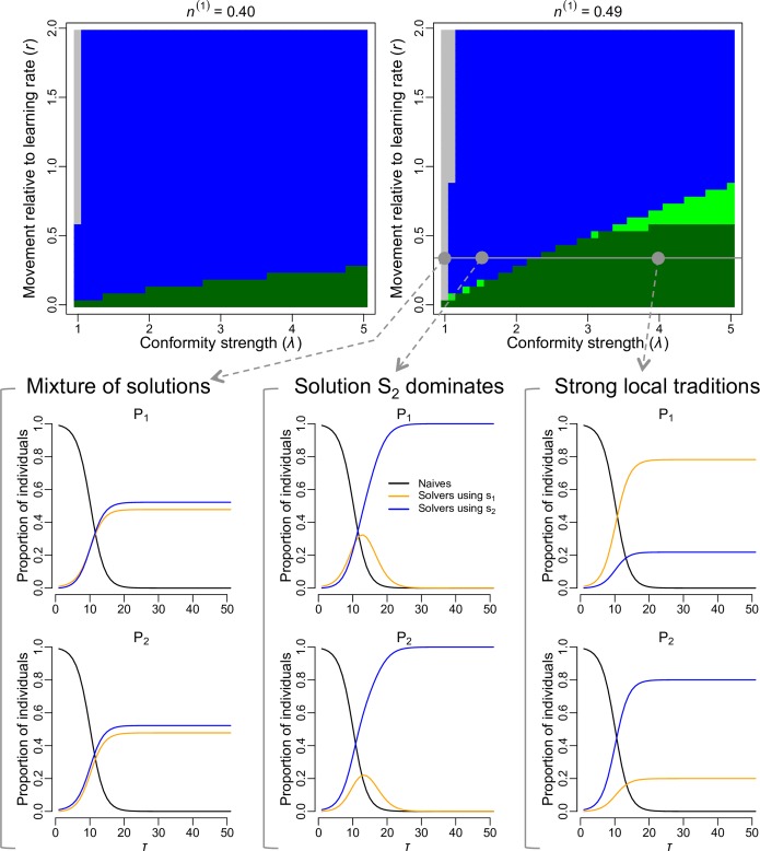
Fig 1. Local traditions emerge when conformity is strong relative to the movement rate.
This panel shows the model outputs for the baseline model with two sub-populations. At the start of every simulation, sub-population P1 contained innovators using solution s1 (1% of its population) while sub-population P2 contained innovators using solution s2 (also 1% of its population). The phase diagrams represent different configurations of sub-population sizes, with n(k) indicating the proportion of the total population size in the system existing in sub-population Pk. Each pixel in the phase diagrams derives from a simulation run with the corresponding parameter values, and the colour of the pixel indicates the emerging pattern after 150 days: grey = mixture of solutions in every sub-population, blue = solution s2 dominated the whole system, light green = weak local traditions, dark green = strong local traditions (see section Analysing emerging patterns in Materials and Methods for details). Three examples of the evolution of the proportion of naïve individuals (black curve) and proportion of solvers using solution s1 (orange curve) and solution s2 (blue curve) in each sub-population, are shown for fixed movement rate relative to the learning rate (r = 0.35) and sub-population size configuration, but with varying conformity strength. When no conformity bias was included (λ = 1), sub-populations had a mixture of solutions; when conformity was relatively weak (λ = 1.5), solution s2 (which was seeded in the larger population) dominated both sub-populations; and when conformity as relatively strong (λ = 3.5), local traditions emerged.

