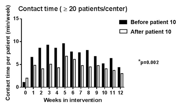
Figure 4.

Contact time throughout the intervention (only including centers with more than 20 patients). The black bars represent the mean contact time (in min per week) per patient from the first 10 patients that were recruited in each center. White bars represent the mean contact time (in min per week) per patient from the patients that were recruited at a later stage. P value indicates difference between the total cumulated contact time over the 12 weeks between patients recruited in early stage versus later stage.
