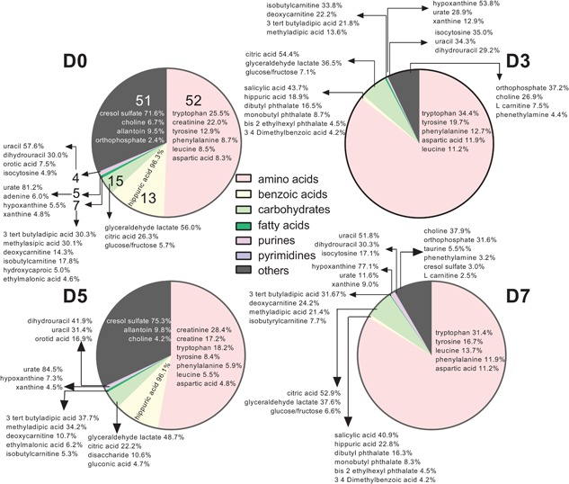
Figure 1.

Pie graph representing the proportion of identified metabolites in uterine flushings assigned to specific subclasses of the human metabolome data set. Each pie represents the sum of intensities of identified metabolites within a subclass as a percent of the sum of intensities of all 184 identified features for Day 0 (D0), Day 3 (D3), Day 5 (D5), and Day 7 (D7) relative to ovulation. Numbers on each pie slice for Day 0 represent the total number of metabolites identified for each subclass (number of metabolites per subclass were the same for each day). The group referred to as “others” includes subclasses with 1–3 metabolites. The percent data within each slice indicates the proportion of the total intensity in a subclass (i.e., sum of all intensity peaks for each subclass) represented by a given metabolite [Color figure can be viewed at wileyonlinelibrary.com]
