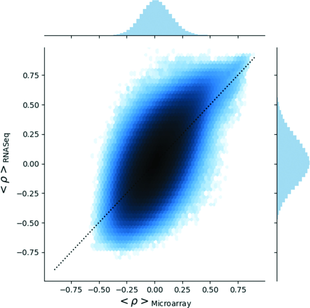
Figure 4.
The 2D distribution of the average gene-gene pair Pearson correlation coefficient. Each point is a gene-gene pair, and its average correlation coefficient within each platform. The x-axis shows the average correlation across microarrays, and the y-axis the average across RNA Seq datasets. Colour gradient indicates areas of high point density (in log scale). Dotted black line is a 1:1 relation for reference. This plot highlights gene pairs with a consistently high correlation in both microarray and RNA Seq data in the top right hand corner.

