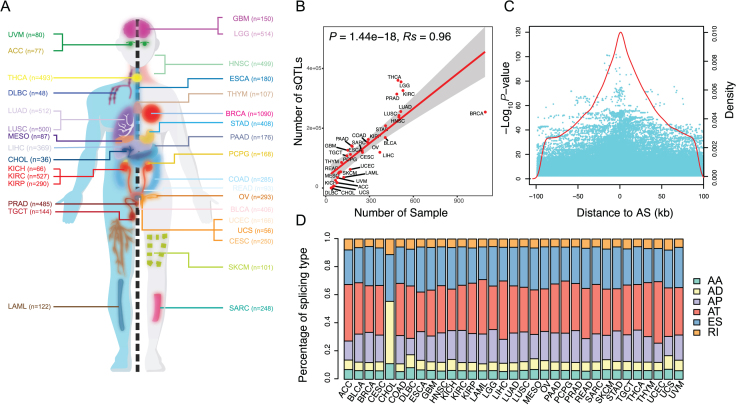
Figure 2.
sQTL statistics. (A) The cancer types included in the study. (B) The positive correlation between the number of sQTLs and the sample size. (C) The distribution of sQTLs. Each cyan dot indicates a sQTL plotted according to its distance from the corresponding AS event and statistical significance of its association with AS (–log10P-value). Red line indicates density of sQTLs according to their distance from the corresponding AS event. (D) Bar plot indicates proportions of sQTLs affecting different AS type (AA: alternative acceptor sites, AD: alternative donor sites, AP: alternate promoter, AT: alternate terminator, ES: skipped exon and RI: retained intron).

