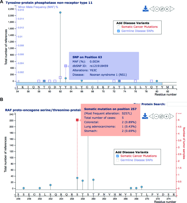
Figure 5.
Adding disease mutations to lollipop plots. (A) The lollipop plot displays PTM sites and disease-associated SNPs (purple squares) on human SHP-2. The inclusion of disease-associated SNPs yields an additional purple vertical axis reflecting the minor allele frequency (MAF), if available. Hovering the mouse over squares yields the display of further details about the disease SNP. (B) Analogously, hotspot mutations from TCGA can be visualized as red squares. In this case the additional vertical axis (red) reflects the total number of tumors having the specified mutation.

