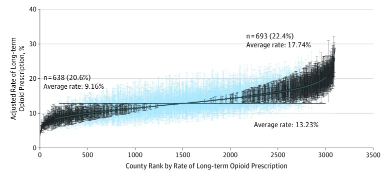
Figure 2. Variation Among US Counties in Adjusted Rates of Chronic Opioid Prescription in 2015.
Counties were ranked based on rates from a multilevel model adjusted for patient characteristics included in Table 1. The black horizontal line represents the overall average adjusted rate. Counties with 95% confidence intervals for rates entirely above or below the average adjusted rate are indicated in black. Results are presented for 3100 counties and 3 759 186 enrollees, a 20% national sample of Medicare Part D files.

