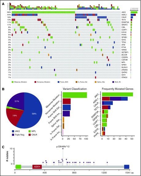
Figure 1.
Molecular profile of MF. (A) Mutations visualized as an oncoplot. Each column represents a sample and each row represents a different gene. The top barplot has the frequency of mutations for each patient, and the right-hand barplot has the frequency of mutations in each gene. By default, samples are ordered by the most mutated genes. (B) Mutational frequency of driver mutations and triple-negative (Triple Neg) mutations (pie chart), variant classification (first barplot), and frequently mutated genes per variant classifications (second barplot). (C) ASXL1 alterations.

