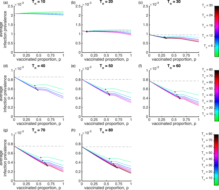
Fig. B.10.
Mean infection prevalence of the SIRWS-bypass model. The mean infection prevalence is shown for varying vaccinated proportion, duration of infection-acquired immunity (plots) and duration of vaccine-acquired immunity (colours). The gray dashed line indicates the mean infection prevalence in the absence of vaccination (). An open circle on a line denotes a Hopf bifurcation that generates sustained oscillations. To its left is the endemic steady state, and to its right, the average infection prevalence as calculated over periodic cycles. Note the different colour scale in a–c.

