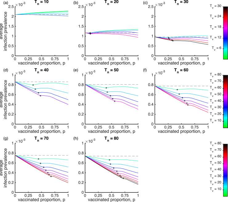
Fig. 2.
The mean infection prevalence for the SIRWS-delay model. The mean infection prevalence is shown for varying vaccinated proportion, duration of infection-acquired immunity years (plots) and duration of vaccine-acquired immunity years (colours). The gray dashed line indicates the mean infection prevalence in the absence of vaccination (). An open circle on a line denotes a Hopf bifurcation. To its left is the endemic steady state, and to its right, the average infection prevalence as calculated over periodic cycles.

