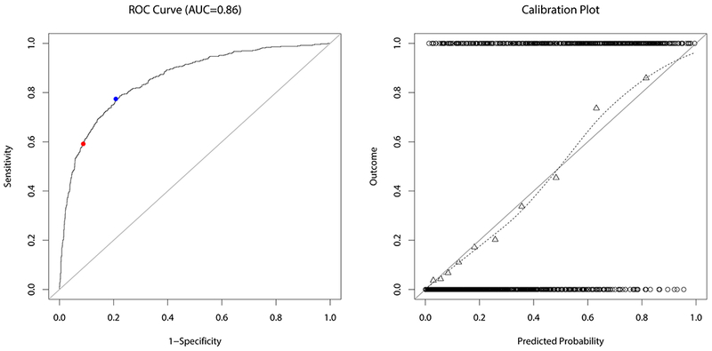
Fig. 4.

ROC curve (left) and calibration plot (right) for the fitted model. The blue and red dot on the ROC curve indicate the value corresponding to a classification threshold of 0.32 and 0.5, respectively. The circles at the top and the bottom of the calibration plot show the observed data. Observed outcome grouped by deciles is depicted as triangles and represented by the loess smoother with the dashed line. For a perfectly calibrated fit, all triangles and the loess smoother would lie on the 45°-line
