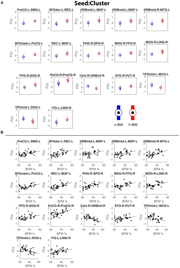
FIGURE 2.
Box plots showing the functional connectivity differences (in z scores) between the two groups for the 17 detected connections (A) and corresponding scatter plots for the correlations between functional connectivity and maternal fat mass percentage (B). See Table 2 for details of statistics.

