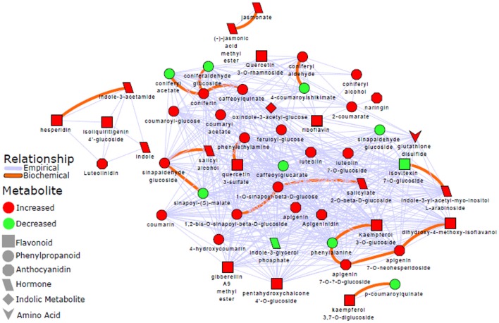
Figure 6.
Metabolic network analysis: A biochemical and empirical network displaying metabolic relationship patterns between metabolites indicated by OPLS-DA as signatory biomarkers. Metabolites are connected based on biochemical relationships (red, KEGG RPAIRS) or structural similarity (blue); as also indicated on the network descriptive legend (left-side). Metabolite color represents relative change (red: increase; green: decrease) in infected plants compared to non-infected sorghum plants. The different shapes indicate the metabolites' molecular classes or biochemical domains. The graph was visualized with Cytoscape version 3.5.0. Applying a Tanimoto coefficient ≥0.7 for structural similarity, the resultant graphic representation and computed network parameters (e.g., clustering coefficient of 0.695; network density of 0.573) revealed a high interconnectivity of the OPLS-DA selected metabolites.

