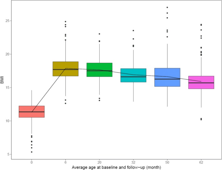
Fig. 7.
Distributions of BMI and trajectories of average BMI for analyzed QNTS participants. The trajectory of average BMI at each follow-up time point based on the entire analysis sample is highlighted by the black line. Boxplots represent the quartile ranges of BMI at each follow-up time point. Outliers are denoted by black points

